A correlation matrix basically computes the correlation coefficients of the columns of a matrix. Here is an example that includes Pearson Correlation Coefficients , Significance, Number of Observations.http://www.kltprc.net/policynotes/Gifs/Tab_005A_4.gif
Stem and leaf plots (or also known as stemplots) are similar to histograms. However they stemplots retain the original data to at least two significant digits, and put the data in order. Here is an example of ages of a family reunion. http://www.eduplace.com/math/mhm/5/06a/ts_5_6a_wi-1.gif
A box plot or a box and whisker plot boxplot graphically shows groups of numerical data through their five number summaries. Here is an example with stopping distances.http://math.youngzones.org/boxplot.gif
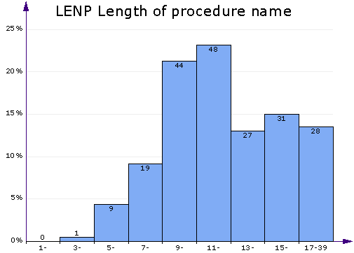
A histogram is a display of tabulated frequencies displayed in a graphical context. It displays what shows what proportion of cases fall into each of several categories.http://www.aivosto.com/project/help/pm-histogram.gif
A parallel coordinate graph connects a series of values, that are associated differently with a variable that measures multiple aspects of something. Here is an example for a baseball team.
A climograph is mainly used by scientists to show a particular location's average temperature and precipitation during the year. Here is an example of one for Memphis, TN
A population profile is a chart that shows the number of people as function of their ages. Here is an example of a of a population profile for the UK census.
An index value plot is where a calcluated value is used and not an abosolute number . Here is an example with wine sales www.winespectator.com/.../022107chart.gif
A Lorenz curve is a graphical representation , and it is a function of the cumulative proportion of ordered individuals mapped onto the corresponding cumulative proportion of their size.
A univariate map is a type that deals with only one subject that looks at occurences of a single event. Here is an example of a univariate map notice that it only has one color scheme which is blue. www.geovista.psu.edu/.../univariatemap.gif
A bivariate map shows two variables on one map by placing two different sets of graphic symbols or colors. The map in this example shows the population and the median
Unclassed choropleth maps where areas are shaded on a continous scale and not divided into classes. Noticed there is nothing on this map differentiating the different areas.
A classed choropleth map is where dated is group in a map to create classes. The categories include equal frequency, equal interval, and natural breaks. Here is the example of the United States that is classed with the percentage of individuals.
Range graded proportional circle map . The cartographer chooses circle sizes for adjacent classes so that the map reader can easily distinguish between circle sizes. Here is the example of the urban population with various circle range sizes.
A continously variable proportional circle maps is a map where the circle area reflects some attribute variable. Here is an example of a circle map of Canada grouped by mother tongue and the various circle sizes with different range sizes.


