A correlation matrix basically computes the correlation coefficients of the columns of a matrix. Here is an example that includes Pearson Correlation Coefficients , Significance, Number of Observations.http://www.kltprc.net/policynotes/Gifs/Tab_005A_4.gif
Stem and leaf plots (or also known as stemplots) are similar to histograms. However they stemplots retain the original data to at least two significant digits, and put the data in order. Here is an example of ages of a family reunion. http://www.eduplace.com/math/mhm/5/06a/ts_5_6a_wi-1.gif
A box plot or a box and whisker plot boxplot graphically shows groups of numerical data through their five number summaries. Here is an example with stopping distances.http://math.youngzones.org/boxplot.gif
A histogram is a display of tabulated frequencies displayed in a graphical context. It displays what shows what proportion of cases fall into each of several categories.http://www.aivosto.com/project/help/pm-histogram.gif
A parallel coordinate graph connects a series of values, that are associated differently with a variable that measures multiple aspects of something. Here is an example for a baseball team.
A climograph is mainly used by scientists to show a particular location's average temperature and precipitation during the year. Here is an example of one for Memphis, TN
A population profile is a chart that shows the number of people as function of their ages. Here is an example of a of a population profile for the UK census.
An index value plot is where a calcluated value is used and not an abosolute number . Here is an example with wine sales www.winespectator.com/.../022107chart.gif
A Lorenz curve is a graphical representation , and it is a function of the cumulative proportion of ordered individuals mapped onto the corresponding cumulative proportion of their size.
A univariate map is a type that deals with only one subject that looks at occurences of a single event. Here is an example of a univariate map notice that it only has one color scheme which is blue. www.geovista.psu.edu/.../univariatemap.gif
A bivariate map shows two variables on one map by placing two different sets of graphic symbols or colors. The map in this example shows the population and the median
Unclassed choropleth maps where areas are shaded on a continous scale and not divided into classes. Noticed there is nothing on this map differentiating the different areas.
A classed choropleth map is where dated is group in a map to create classes. The categories include equal frequency, equal interval, and natural breaks. Here is the example of the United States that is classed with the percentage of individuals.
Range graded proportional circle map . The cartographer chooses circle sizes for adjacent classes so that the map reader can easily distinguish between circle sizes. Here is the example of the urban population with various circle range sizes.
A continously variable proportional circle maps is a map where the circle area reflects some attribute variable. Here is an example of a circle map of Canada grouped by mother tongue and the various circle sizes with different range sizes.
The digital orthophoto quarter quadrangle is a Ais a computer-generated image of an aerial photograph in which image displacement caused by terrain relief and camera tilts has been removed. Here is a DOQQ example from geospectra
A digital elevation model is a digital representation of the ground's topography. In this example of Barbados you see the different levels of elevation represented by various colors.
Digital line graphs are digital vector data that reprosent cartographic information. Here is an example of a digital line graph of the South Western part of the U.S.
A digital raster graphic is basically an scanned image of a USGS topographic map. In this example of a DRG map of Alaska. Notice the topography defined in the visualization of the mountains photographed in Alaska
Isopleths are items of meterological charts that connects points that share an equal value of some variable. In this example, the map of the temperatures in the United States. You can see the various lines circling the areas with the same temperatures.
An isohyet is a line on a map or even a chart that connects areas with equal rainfall. In this example we have a map of Hong Kong with isohyets being represented as blue lines
Isotachs are lines on a given surface connecting points with equal wind speed. Included is an example of isotachs of the United States depicted in shades of purple with the higher speeds
An isobar is a contour line of equal or constant pressure in meteorology. Here is an example of an isobar in the country of Germany . Notice the different pressure signified by the different color lines.
Lidar stands for Light Detection and Ranging. LIDAR is an optical remote sensing technology. Lidar measures properties of scattered light to find range of a target. Above is an Austrailian LIDAR. www.aad.gov.au/.../twia_lidar_beam_lge.jpg
The doppler radar is a form of radar of using the doppler effect, by which the returned echoes from targets to measure radar velocity. The example above is of a Doppler in Melbourne
Infrared photos can be used to show changes in the environment, forestry, wetlands, and the oceans. Included in this example is a infrared photo of a forest
Cartographic animation is a visualization technique that displays dynamic geographical phenomena through its ability to show interrelations amongst geospatial data's components, location, attribute and time. Here is an example of a cartographic animated data of Nebraska and cancer related deaths
Statistical Maps are used to demonstrate the distribution of a variable over a geographic area. The example included is a map of the distribution of corn by acres in the United States
A cartogram is a map it is abstracted to where base of which is not true to scale. In this included example is the map of threatened and endangered species percentages by country. Notice the various sizes of the continents are distorted. http://www.amphibiaweb.org/amphibian/cartograms/cart_threatenedpercentage.jpg
Flow maps are used to show the movement of objects from one location to another. This movement could include the number of people that are migrating, the amount of goods and services traded, etc. This example includes a telecommunications flow map.
An isoline map is a map that has continuous lines joining points of the same value. Some examples of isoline would be equal altitude temperature ,barometric pressure, wind speed and wind direction. This example is of China and notice here the different lines (dashed or straight) connecting different parts of the country
A proportional circle map scales circle area to the value that is ususally a total for a geographic area on a map. This map can be an an alternative to the choropleth map. This image is a proportional circle map of Germany and the major industries
Choropleth maps use color to portray quantitative information. It can be used for percentage and density for a geographic region. This example looks at the percentage amount of Hispanic population per a county in Florida.
Dot distribution maps are used to show a quantitative number of a geographic area. Each dot refers to a number. In this example of earth each dot represents 100,000 people.
Propaganda Maps are those used to sell or used to persuade an audience's opinions about a targeted subject. The map in this example is used show states who hire illegally.
Hypsometric Maps are used to measure height. It gives the elevation of an area by contours. This can be represented through shading. In this example, we have a hyposmetric map and in the image you are able to see the elevation areas through the shading.
Here is an example of a PLSS Map (Public Land Survey System). These maps are used in America and they are typically for surveying and identifying land parcels. This information is used for titles and deeds of undeveloped land. In this example is a PLSS map of the state of Alabama.
Cadastral Maps focus on boundaries which map include street names, lot numbers etc. The example included is a map of residential area and the streets, small bodies of water, and highways. www.rpdata.com/news/images_rp/feature/mapping.jpg
Thematic Maps contain a basic theme or spatial pattern. For instance, the map in this example is provided by the U.S. Census bureau and its displays the population shifts over various years. The different color groupings corresponding to the different categories.
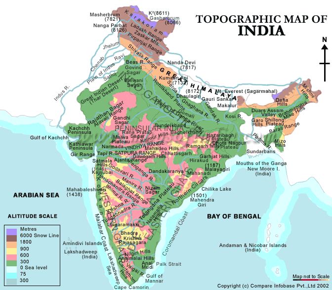
Here is an example of a topographic map of India. The uniqueness of topographic maps is that shows the contours of the land as well as bodies of water. In this example we see several bodies of water such as the Arabian Sea and Bay of Bengal.


